
Sunday, 30 January 2011
Characters
I was looking forward to designing my character and yet not looking forward to it at the same time. I knew from the concept of my game that my characters were human and so I did not have a lot of leeway with their design. I had to keep them looking completely normal. In fact the only abnormal thing about my protagonist's design was the body-suit that he and another couple of the characters wore. The transmutation body-suit, or as the characters nick-name it the 'mute-suit'. Though I had a vague idea of how I wanted it to look I was completely free with how I could design it, my only constraint was that it had to be skin-tight so that the characters could wear it under their normal clothes. So I began with the task of the 100 silhouettes. Many of them looked ridiculous or at least nothing that would look like an actual body-suit because as with the pod's; I had to remember that these suits had to have a practical backing. They had to look like they had been designed by scientists instead of just a suit that a gymnast would wear. Several of them did begin to appeal and I ended up with 6 that I liked the look of enough to work on further...
 My next step would be to add colour and work out what these materials the suits would be made of.
Tuesday, 25 January 2011
All things in their place.
The final step in creating my environment was to create the background for my pod, this was essential as the background and the setting would be what would give the pod it's mood and feeling and give it a sense of scale.
I played with a few simple flat environments at first, just giving the scene a sense of depth, I didn't want to work on them to finely, as I kept in mind Nichols (2007) who states "When sketching ideas early in the concept phase, it's more important to capture feeling rather than detail. Overly detailed images at the early stage can often polarize more than it inspires" (2007:148)


I played with a few simple flat environments at first, just giving the scene a sense of depth, I didn't want to work on them to finely, as I kept in mind Nichols (2007) who states "When sketching ideas early in the concept phase, it's more important to capture feeling rather than detail. Overly detailed images at the early stage can often polarize more than it inspires" (2007:148)


Sunday, 23 January 2011
More research
While researching environment, I decided to try my best to contact as many games companies as I could to see if I could get an interview with their concept team. After many emails harassing their staff I managed to get an interview with Ninja Theory's lead environment artist Jim Waters, the following is the transcript...
Can you give us an idea of the games you've worked on?
- I Trained as an Illustrator and started career as a designer in the theme park industry, doing concept art, traditional model making, construction drawing and scenic art
- I Joined Codemasters in 2002, worked on LMA manager 2004, LMA manager 2005, LMA manager 2006, Club Football, Club Football 2005, Brian Lara Cricket - I worked as a UI artist, environment artist, FMV artist and R+D artist over the course of 4.5 years
- I Joined Ninja Theory in 2006 and worked on Heavenly Sword as a Senior Environment Artist, Progressed to Lead Environment Artist on Enslaved, and I am now working on DMC
Can you describe the process that you go through when designing an environment?
- From a practical point of view, work closely with Art Directors, Designers and fellow Environment Artists to holistically approach the level from various standpoints so as to allow for a smooth, unified development workflow, allow time for regular updates to all involved, ensure regular concise communication between all departments.
- Artistically, work from the overarching mood set by art direction, rough out the level in simple geometry, have a wander around in UE3, get a feel for the spaces involved, and the pacing and contrast of those spaces. Add rough lighting at this stage as well, this can change how you feel about the overall size/atmosphere of a space
- From initial concept art, work out a rough asset list, this will allow you to budget authoring time for your project more efficiently and allow you to focus on the most important elements of your environment. Also, agree an overall workflow with any other parties involved, this will enable a much more coherent end result.
- Work up assets in detail, add to level as soon as possible, especially if working with several other artists, this allows early balancing between textures and approach, if you need to make changes, the earlier the better!
- Have regular quality reviews and be harsh on yourself. Prioritise reworks to ensure most important jobs are always completed first.
What would you say are the most important things to consider when designing environments?
- Readability and Believability - can the player see where to go in the level from a functional point of view, does your art placement support this? Does your environment make sense? It is all too easy to jumble assets together and lose sight of the perceived narrative function of any given asset or collection of assets in the world.
- Working within your budget, yet remaining creatively vibrant.
Is it becoming harder to think of original ideas for environments?
- Not really, it's always a massive challenge, and always will be. Approach from as broader range of reference and artistic knowledge as possible, try to think unconventionally in terms of high level concept. Never accept the first idea that comes to you, push it around, add to it, take from it. Don't be afraid to try something different.
What would you say are the best examples of environment design in video games?
- Resident Evil 2,4 and 5, Red Dead Redemption, Uncharted, Ico, Final Fantasy vii and viiii. (Probably loads more, This is just my opinion this morning...) ;)
Would you say environment design in video games is different from other mediums?
- Only in a technical sense, the application of artistic and creative knowledge needs to remain foremost in anything that is visually challenging and stimulating.
Are there any common pitfalls with environment design?
- Disregarding or losing sight of the functional requirements of the art that is being created
- Technical inconsistencies between artists - unify your workflow approach when in a team.
- Adding too much stuff! It can be all too easy to clutter a scene, can the player see where to go? Take regular screenshots, overpaint them to help keep yourself in artistic control of your scenes.
What is your best advice for anyone wanting to do environment design as a career?
- Do it with full commitment and passion. Be inclusive of the ideas of others. Work as a unit with other members of your team.
Would you say character design has a large impact on environment design?
- Ultimately the Art Director will be putting together the overarching view of the world and the characters in it, therefore establishing the environmental narrative early on and setting visual rules/frameworks for the Environment art team to follow and create within.
Are there any environment design 'bibles'? or best books on the subject?
- Not to my knowledge. sorry. The only info I have ever had regarding the subject has been at a practical level during my career.
Is there anyone in particular you admire in the field?
- Anyone who has gone through the process to create something visually compelling and performing in frame has done a damn fine job. ;)
- The vast amount of talented and hardworking colleagues who have taught me through my various jobs over the past ten years.
Jim's interview was very insightful and reinforced the requirement for research and creativity when concepting.
Playing the angles
After I selected what I thought to be the best of the designs I had done, I began to work on them further. Designing what I thought they would look like from other angles and trying to get a feel of how they would work as devices in my game...


The second design (above) I liked because although it did look like a pod, I liked the style of the off-shoots as they resembled ovaries, giving the design an organic yet high-tech feel. When creating sci-fi environments, Hanson (2004) states "It is important to pull back from fictional excesses - or the more outlandish probabilities - to make the story and it's environment more plausible" (2004:91) This was important advice to consider as even though my narrative and hence my environments did have a sci-fi under-pinning, it was still set in the present.
Both designs needed a lot more refining and I still had to see if they would work in an environment.
I began to think that I didn't want to choose between them and perhaps I could utilise them both in different parts of the environment I had in mind.

I liked the look of the design above as it didn't resemble any kind of pre-existing pod and it was original and at the same time delivering it's practical needs as a device to administer nano-bots to the human body (I could see in the design that they would be injected in the spine and intravenously).

The second design (above) I liked because although it did look like a pod, I liked the style of the off-shoots as they resembled ovaries, giving the design an organic yet high-tech feel. When creating sci-fi environments, Hanson (2004) states "It is important to pull back from fictional excesses - or the more outlandish probabilities - to make the story and it's environment more plausible" (2004:91) This was important advice to consider as even though my narrative and hence my environments did have a sci-fi under-pinning, it was still set in the present.
Both designs needed a lot more refining and I still had to see if they would work in an environment.
I began to think that I didn't want to choose between them and perhaps I could utilise them both in different parts of the environment I had in mind.
Real life
In order to get a look at how large scale devices and the rooms they were in looked in the real world I contacted various hospitals and asked if I could come and take a few photo's of their large scale scanners like the MRI and CAT scanners. Eventually after a lot of emails, I managed to persuade the Norfolk and Norwich Hospital to allow me to take some.
They were very helpful and I was able to obtain the shots below, the photo's of the MRI scanner and room had to be taken from the door as the camera was not allowed into the room itself.


These shots were helpful for references for the types of materials, contours and color schemes that I would like to use. However I wanted a much more dramatic and dynamic look for the rooms the devices would be in.
Monday, 17 January 2011
Let there be Light
This week we looked into the effects of the different types of light on our work and how it can completely alter the look and style of an image. This was something I wanted to use in my concept images and see which type of light would work with my environments.
Below is an example of diffused reflected light in a painting by Ivan Aivazovsky called "A Moonlit View of the Bosphorus". The reflected light gives the tonal variations of color on the water's surface as well as the vague reflections on the water's surface...


Below is an example of diffused reflected light in a painting by Ivan Aivazovsky called "A Moonlit View of the Bosphorus". The reflected light gives the tonal variations of color on the water's surface as well as the vague reflections on the water's surface...

The next painting "Tunnel of Wealth" by Patrik Hjelm shows a lot of bounced light in the walls of the tunnel, seeming to come from the point in the distance. It also shows some dynamic occlusion on the rocks on the walls of the tunnel.

These lighting studies and techniques led me me want to use much more lighting effects in my own studio work, especially in my finished environment pieces.
Brinkman (2008) states "Any time you add a new element to scene, you should think about how the lights in the scene would effect this new element". This was how I wanted to show the scene and make the environment look more like an actual physical environment rather than a flat image. Brinkman continues to explain that different lighting can completely change the mood and feel of a scene.
This image by James Clyne, concept art for 'Transformers' uses light well as the light is reflecting of the smoke in the building, again there is quite a lot of ambient occlusion here but also great use of shadow to create shapes...

I used what I had learned about lighting to change things in my own scenes, I was very pleased with the changes that occured in the image once I had added lighting and shadow and paid more attention to those details...


Sunday, 16 January 2011
Hitting the books
I immediately started to research games concept art with a focus on environments, what quickly became apparent was that the large majority of concept art that is available to view, is not the early sketch work but rather the finished painted pieces such as this picture from EA's 'Dante's Inferno'.


This is understandable as most game companies and indeed games designers only want to showcase their best works, however it did not help me find many examples of the development of environments. Many of the books I researched on the topic such as... "Art of Darksiders" were also very sparse when it came to showcasing pictures of very early concept art.
There were also far more 'Art of..." books based on films that showed the art development than there were on digital games.
I collated as many of these as I could and began to look at how the professionals designed their environments.
The best of these were...
The Art of District 9 - Falconer, D (2009)
The Art of Darksiders - Madureira, J (2010)
The Art of Star Wars: Episode III - Rinzler, J.W (2005)
Behind the Mask of Spider-Man - Cotta Vaz, M (2002)
The Art of X2 - Shaner, T (2003)
The Art of Midway - Zucker, F (2007)
Compositions.
In today's lecture we looked into using composition more in our work and the different types that exist. The composition types use mathematics and geometry to make the composition of images more aesthetically pleasing. This is something that was very useful to learn as in many of the images I had previously done for my projects, the temptation was just to stick the image on the middle. Now using the tenements of composition I'm able to make the images look a lot more aesthetic.
The picture below "Supergirl" by Adam Hughes uses the diamond type composition, quite common in the comics industry to make the subject more dynamic and heroic.

The next image uses the golden rectangle type also known as the Fibonacci sequence and is evident not only in art but in nature as well. Scientists have shown it to be prevalent in a lot of the structure of various organisms such as this nautilus, one of the oldest creatures on the planet...


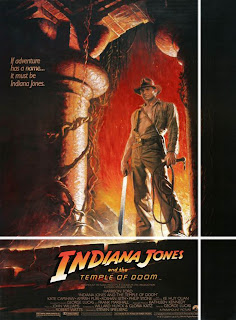
Finally the next, quite iconic picture is Drew Struzan's poster for 'Indiana Jones and the Temple of Doom". Whether Drew was aware of it at the time or not, as he doesn't mention it in his book but it largely follows the 'L' composition type...
I had put the final touches to my scenes and got them to look more or less how I wanted them to look but I had another obstacle... After our lessons in composition, I looked at my scenes with more of a critical eye, seeing if they lined up with Fibonacci's rule. Many of them didn't and many of them when looking at things through the critical eye of composition were poorly placed so with some advice from my tutor I cropped and rotated my images so that the centrepiece of the image is at the Fibonacci hot-spot or another tenement of composition. Below are the final images showing the lines for composition...

The picture below "Supergirl" by Adam Hughes uses the diamond type composition, quite common in the comics industry to make the subject more dynamic and heroic.


This is the painting "Woman sitting on a table" by Smita Madwallipar, you can see how closely it follows many of the lines. It is hard to think that Madwallipar structured this composition by accident.


I took what I had learnt and applied it to my own scenes, I was surprised how much better the images looked after the composition had been adjusted.
Friday, 14 January 2011
The contenders
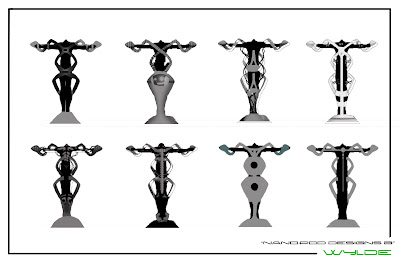
Below are the designs I chose and the rudimentary worked up versions...

I created a poll and invited as many people as I could to state which of the 9 they liked best, the results of which are below...

Unfortunately there wasn't enough clear winners to draw a conclusion and I had to go back to my own judgement so I immediately eliminated numbers 1 and 2 as I thought they were too reminiscent of other pods in movies/games and I wanted my design to look as original as possible.
I also eliminated number 5 and 9 as they had counterparts in the list that they were too similar to which I liked more.
My next step would be some research, now that I had my own designs, I could now look more into concept design without fear of being influenced by pre-existing designs.
Wednesday, 12 January 2011
Refining
Once I had finished the 100 silhouettes, I chose 5 that I preferred and started to work up a few different versions of each. I worked up the versions, making them look more like pod-designs that would work in my game. Although I went in to the project with pre-conveived ideas of how my pod would eventually look, I kept an open mind for anything that would look better and more original.
With some of the silhouettes I chose, they resembled pods already but a few of them needed work to make them look like a practical device. After a few attempts it became a case of seeing shapes within shapes and making the parts that I liked work.
Below are some of the versions of one of the silhouettes...
 This way of thinking is advocated by Yamada, (2005) "I often start a character design with quite a few quick exploratory sketches. I use it as a way to get all the cliche and preconceived ideas out of my system" (p14)
With some of the silhouettes I chose, they resembled pods already but a few of them needed work to make them look like a practical device. After a few attempts it became a case of seeing shapes within shapes and making the parts that I liked work.
Below are some of the versions of one of the silhouettes...

Tuesday, 11 January 2011
Throwing crazy shapes
“Empty your cup so that it may be filled; become devoid to gain totality.” - Bruce Lee (1975:81)
Our first task with the design of the environment was to draw 100 silhouettes of vague shapes to gain inspiration for out design. The point was to remove all preconceptions of the design and open your mind up to inspiration.


Our first task with the design of the environment was to draw 100 silhouettes of vague shapes to gain inspiration for out design. The point was to remove all preconceptions of the design and open your mind up to inspiration.

As you can see the pod silhouettes start out familiar and quite generic, I would guess since they were the first things out of my brain and also because I was too focused on practicality rather than form. However the more silhouettes I did, the more creative they became. Especially when I started using programmes other than Photoshop to create them. Many of the later silhouettes were done using 'Alchemy' and Sketchbook Pro. Two programmes that I found excellent to use as they worked by disengaging the practical style of my thoughts and created just random shapes that I could then mould and augment as I wanted.

I started to see shapes within shapes that I was interested in and started to work on refining the designs further, keeping the ones that interested me. Finally I chose a few designs and started to work some detail into them, making them look like workable forms as opposed to abstract shapes. Interestingly many of the designs that interested me were not instantly recognisable as 'pods'.
Thursday, 6 January 2011
Beginning Environment Design
Our first task with BA5 was to choose to design an environment in our game design. Due to the fact that my game is based in a very ordinary city, with very little that makes it different from any other modern urban city, I found it difficult to choose a part of my game's environment to focus on that I could be creative with.
With that in mind I decided to focus on a specific part of one of the environments in the game that was original. The nano-tech lab. As I didn't want the lab to look too far fetched I decided to further focus in and design one of the parts of the lab; one of the nano chambers.
I deliberately didn't look at existing concept designs and models for stasis chambers and the like, as I didn't want to be too influenced by what already exists. I was obviously aware of ones that I remembered from films such as the stasis pods in 'Alien', the Bacta tank in 'Empire Strikes Back' and the telepod in 'The Fly'.

But asides from these famous examples I didn't research them as I normally would. I wanted my pod to look unique. However once I started sketching out designs it became difficult not to draw something that looked either a) too similar to one or more of the above or b) too generic a shape.
With that in mind I decided to focus on a specific part of one of the environments in the game that was original. The nano-tech lab. As I didn't want the lab to look too far fetched I decided to further focus in and design one of the parts of the lab; one of the nano chambers.
I deliberately didn't look at existing concept designs and models for stasis chambers and the like, as I didn't want to be too influenced by what already exists. I was obviously aware of ones that I remembered from films such as the stasis pods in 'Alien', the Bacta tank in 'Empire Strikes Back' and the telepod in 'The Fly'.

Subscribe to:
Comments (Atom)